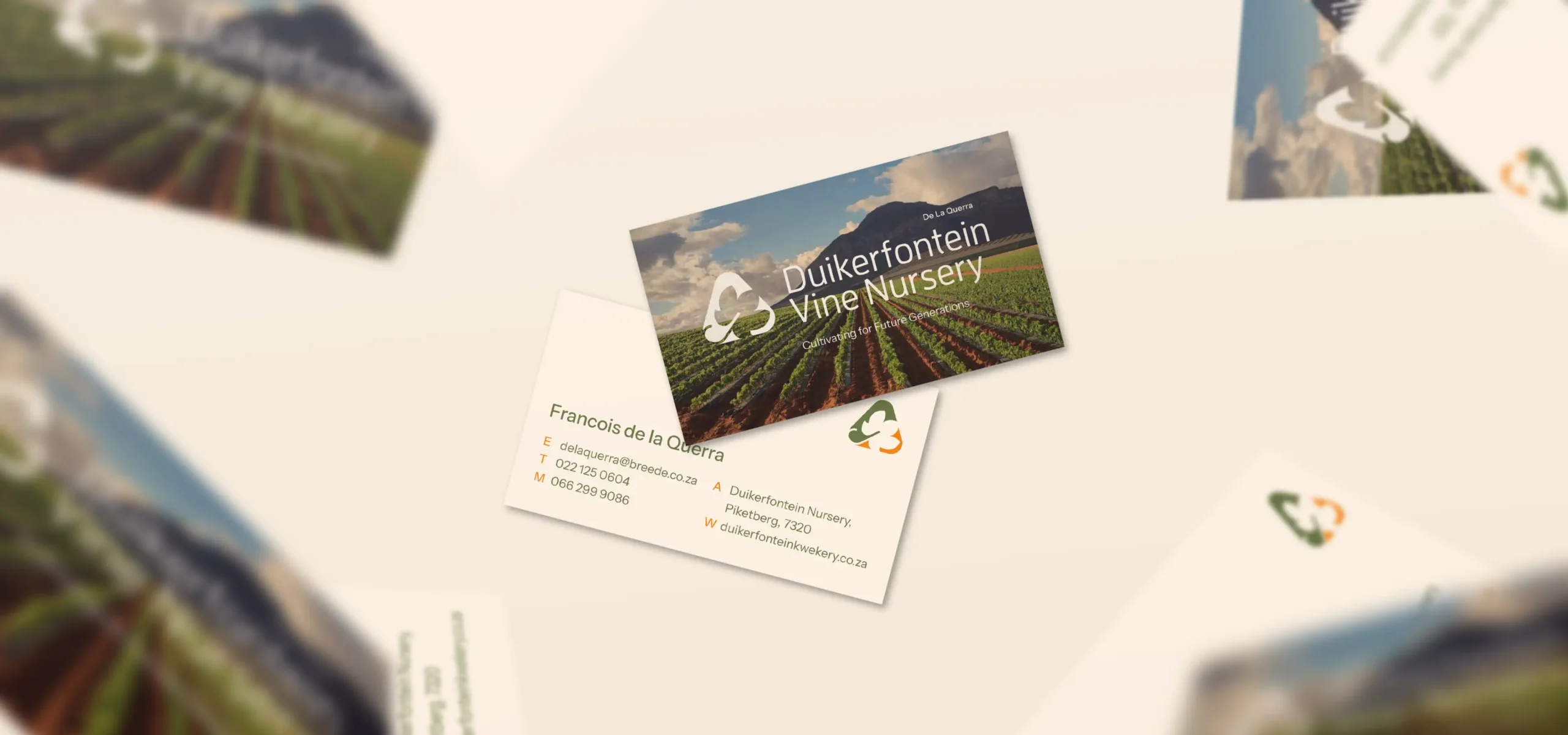
“We designed a logo reflecting the brand’s story and founders in a modern, globally recognisable style.”
Project Overview
The challenge
When the client first approached us, they had yet to establish a logo or corporate identity (CI). Our task was to help them create a brand identity that accurately and authentically reflected the character of the vine nursery while maintaining a modern feel that would become recognisable in the international viticultural landscape within which they operate.
The solution
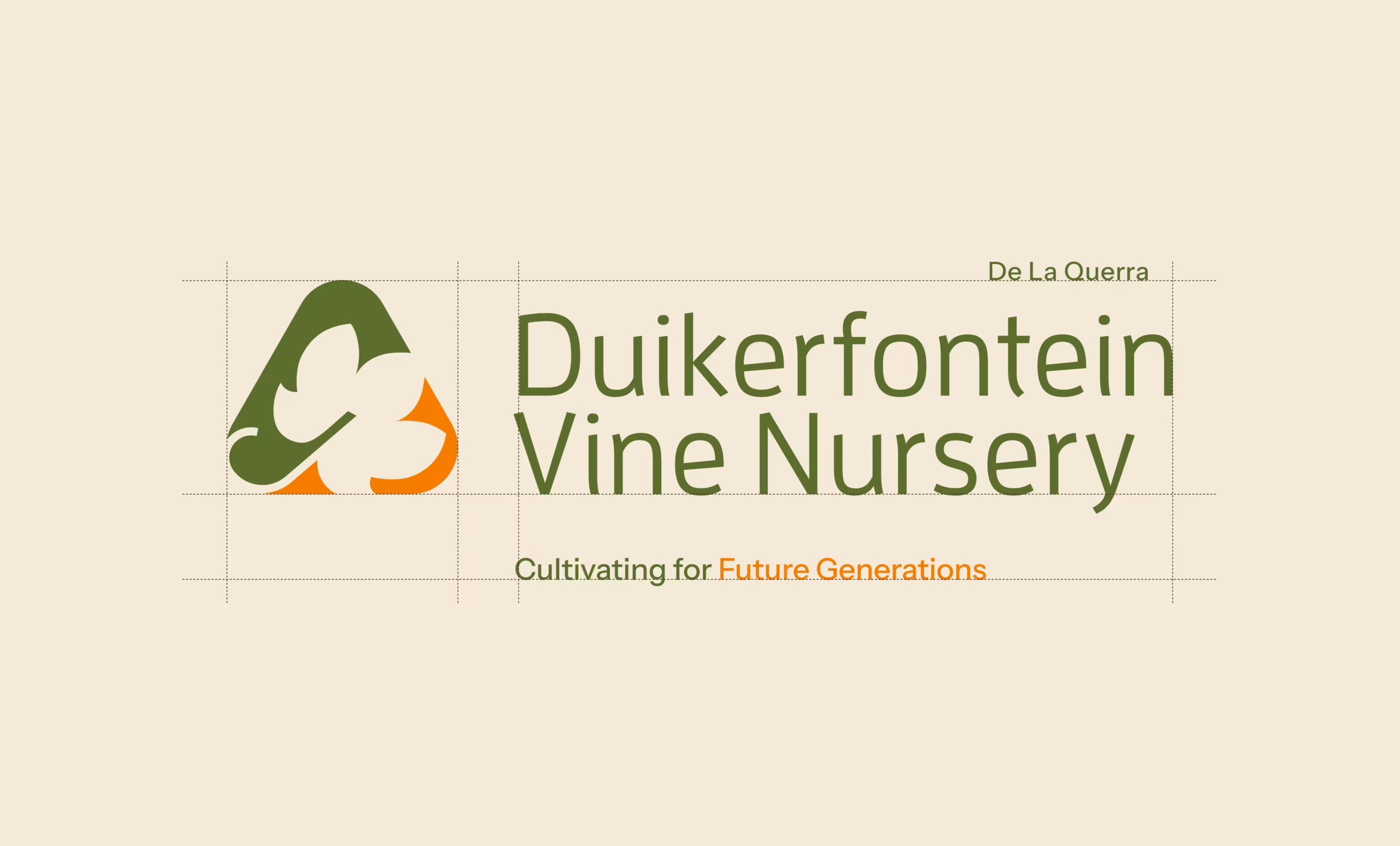
During our phases of brand discovery and CI development, we wanted to stay true to the essence of the brand by incorporating a ‘rule of three’ into the development of the logo, representing the three brothers and co-owners. We also experimented with a wide range of elements that reflected the vine nursery element of the brand.
The result
We presented the client with 4 logo options and they immediately fell in love with the one that now stands bold as their logo. This logo incorporates three parts within a triangular shape of which the main element is a vine leaf, establishing context for the brand. This provided the groundwork for setting up a brand identity that further resonated with the character of the brand.


